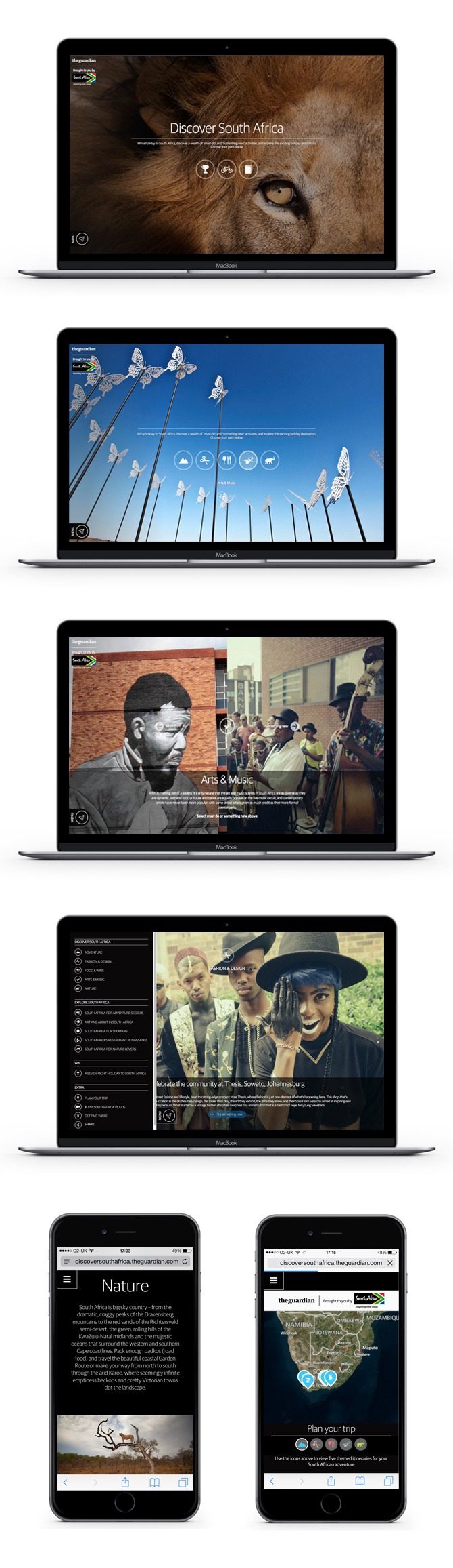
Unique 'Discover South Africa' split screen website
Responsive Design | UX/UI
-
The brief The Guardian received from the South African tourist board was a tricky one - showcase the activities that their country offered, but split into two areas - classic South African activities (must-do) and things you might not think the country offered (something new).
A lot of UX/UI planning and thought went into this website to maximise a way to elegantly get across the brief but to do it in a way that gave equal prominence to both "must-do" and "something new" areas. Working with creative technical agency, Pixeled Eggs, we produced the site wireframes and eventually we decided on with a novel split screen idea to solve the problem. Obviously, the photographic would be stunning and I spent a lot of time executing many icons and buttons that would enhance the user joinery experience.
The site worked equally well on mobile and was a really pleasing job to be involved in.
Click here to read a case study of this project