Guardian website article redesign and development.
Concept | Responsive redesign | UI
-
I was briefed by Allister Campbell, the Creative Director of Guardian Labs, to redesign a whole host of content areas and online elements for the Labs website, which could also be rolled out throughout the full Guardian website for news and features content. As the Guardian website has been constantly winning awards globally since it’s launch in Jan 2015, it was both an honour and an unerring task to attempt to redesign parts of what has been branded the best website in the world today.
In Guardian Labs, the commercial wing of the business, it was essential to win and keep new clients, so by offering potential clients a more bespoke environment on our website to host their campaigns then we feel they would be receiving enhanced value and would be more willing to collaborate with us.
To start with, I took a look at redesigning the article pages and would then move onto campaign hubs, galleries, illustrated & animated long-form pages, quizzes and then traffic driver ads. This selection of content is the bread-and-butter digital elements of what we offer for a campaign. I would need to take into consideration, how these designs would work on mobile and tablet. I would come up with a set of templates that the web team could use on a daily basis that not only looked great but were efficient in build time.
First step was to set up an Agile team to handle the project. Included would be our Creative Director, a project manager, a member of web development, a content manager, a picture editor and myself. I started off with some UX research and wanted to find out what the 100 members of the Labs dept found worked and didn’t work in examples of content areas and hubs of websites they have seen. My finding was that there seemed to be a fundamental rule for article pages that they are usually designed in a quite standard way (obviously helpful for responsive reasons) - this was fine but as we are trying to make our article pages feel unique and standout then we had to break away from the norm.
This was my challenge - obviously, different uses of fonts and colour would bring things to life but I needed to go deeper and look at how we could push the functionality and get people more emerged and involved with the content we were producing. I have designed a lot of interactives for clients whilst at the Guardian and understand the importance of engaging users in uncomplicated way but each design was quite bespoke and that answered the need for their individual problem but designing a series of article templates which constantly felt fresh as well as bespoke each time was a big task.
I researched then what the current and on-trend design practices were around the world and looked at what might be possible to enhance our current content areas. Over the next 6 weeks, I led the team to push the boundaries and experimented with new ways of incorporating design techniques, functionality and animation.
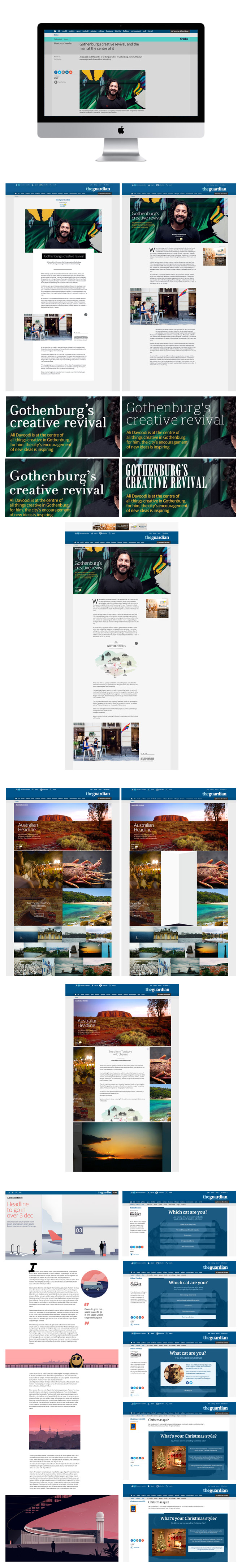
ARTICLE PAGES. Looking at the current design, my one problem with that it, well looked dull and just like any other article page - image, headline and story. I played around with various designs but felt that the large image at the top of the page really set the scene and offered huge impact. We could set fixed headline and subheading areas and offer a more lifestyle feel. This gave us the chance to really push the great photography we have for campaigns, especially with the photoshoots we set up. Not stopping there, I pushed it further with full-screen sliders at the top of the page so you got a real flavour of the content right as soon as you have clicked on the page.
Keeping the impact level high, I used with larger image galleries that also offered different and satisfying usability. When starting this project, one of the things I really wanted to use was the excellent talent we had in the Guardian Labs. There are several designers and animators that had skills which i could envision being the cornerstone of several design templates. Jim is a very talented animator and his use of Adobe Edge really brings projects and interactives to life. I felt that we needed to make better use of his talents in day-to-day articles and campaigns as well as longer-term projects. Things like animated and interactive maps embedded into articles, stats and little stories brought to life to really offer clients and users unique experiences in the content.
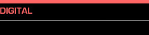
CAMPAIGN HUB ENVIRONMENTS. Looking at hubs next, I felt it best to keep with the image-leading approach. Research has shown that users like big visuals and are more inclined to click on them rather than smaller images. I was always encouraged to think out-of-the-box and to really push things and I did just that with a design that I felt was quite unique. What if a user could click on a campaign hub and when looking at an article and you don’t leave the hub area - you stay in the hub and through clever javascript code, you can read that article as it folds open.
ILLUSTRATED & ANIMATED LONG-FORM PAGES. Some articles deserve that bit more detail to really tell the story as best as possible. Travel articles for examples are something we could really push hard and offer more of a journey rather than standard paragraphs and they could feel feel visibly unique if we went down an illustration route rather than photography. Using a different illustrator for each long form would keep the designs constantly bespoke and evolving, then subtle use of animation, all done in-house, would really add a new dimension to each article. This design template was my favourite as it was a simple concept but the outcome was always stunning. Full responsive, each long-form would be easy to build as there are 5 key illustration areas with set sizes.
QUIZZES. A fun piece of content we offer is the good old online quiz, but the problem is they are currently very basic and don’t really inspire you to interact with it. My first approach was to make them feel ‘more Guardian’ with fonts and brand colours. I designed two versions - one with an image for each question and one which was text based but had a styled image set in the background.
We spent several weeks fine-tuning the designs and in the end I felt like we had produced something new, fresh and unique for potential clients and something that was capable of taking the Guardian website to the next level. There was a question mark over the image-led article hubs but this design was always one that was more of a starting block to bigger conversations to see what was possible but then that was always an intention. .
Initial feedback was very positive for all parts of the business and the head of Guardian Labs was keen to get the designs into production as soon as we can, then get then in front of the Guardian Creative Director Alex Bruer to see if we could take the designs to the other sections of the website. So, to be continued…..