David Marshall Photography
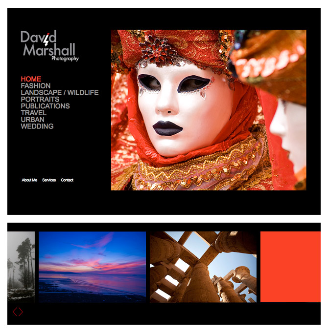
David wanted a redesign of his previous website and new logo to showcase his growing photography portfolio in a fresh and simple way. We decided to go with a horizontal scrolling website which really reflected David's take on Photography as a whole - to do things a little differently.
This design allowed him to show large categorised images instantly rather than going down the usual thumbnail / lightbox route. The side scrolling offered a slicker view of his work with greater visual impact.
