Wireframe for Good Food Ireland
- Original website
- Wireframe
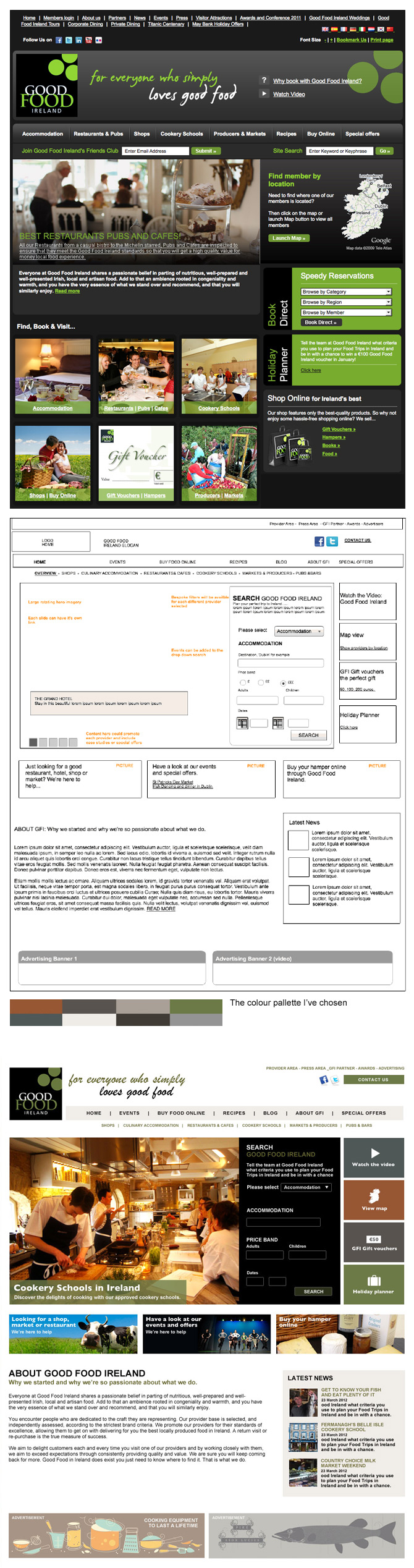
- Colour palette
- Final layout
A Creative agency asked me to redesign them a website for them, for which consumers can use when planning food-based trips to Ireland. They had the wireframe already made so just wanted me to work on the design. Their brief was to refresh the tired and corporate looking site and help provide a clear message about Good Food Ireland as a brand and business and highlight it's services.
I decided to stick with the current logo design as GFI have spent a lot of time building their brand and it will be instantly recognised. All I did was tone down that bright green to the more stylish and subtle green.
The first thing was to take the current website away from the black, grey and bright green feel. The homepage has a lot going on and although it isn't too busy on the eye, it does feel very corporate and aimed at older clientel. We need to get across the simple message of all good things food related in clean and simple way. The fact it is in Ireland shouldn't be reflected too much in the design, so no need for any overuse of green!
I started with a white container and added a worktop/chopping board background to tie in with the platform of food. As the site needed a lot of nagivation and buttons on the home page, I resisted the urge to use images on all buttons as it may be too much to look at. So with that decided, menu nagivation is kept very simple: same font and using either green or black. The top prominent menu has the beige background, which matches the LATEST NEWS panel at the bottom of the page [which also has the 70x70px thumbnails added]
Excellent appropriate photography on the slider really brings the homepage to life. Slider headlines and subheaders are put on a green overlay with lowered opacity. The four right hand nav buttons next to the main image would work best in their simplest form of good wholesome earthy colours and small icons. The colours I chose compliment each other very nicely and don't stand out too much leaving the main image as the the first thing your eye sees on the page. Main search panel is black so matches the logo.
The three main buttons under the slider and search panel offer a chance to show a bit of the fun and personality the company wants to get across. Great photography makes this work a treat. You can never go wrong with a picture of a cow - always works! I designed and added some adverts at bottom of page to complete the mock-up. The agency loved it as did the clients so I sliced it up and it was then send on to be built.