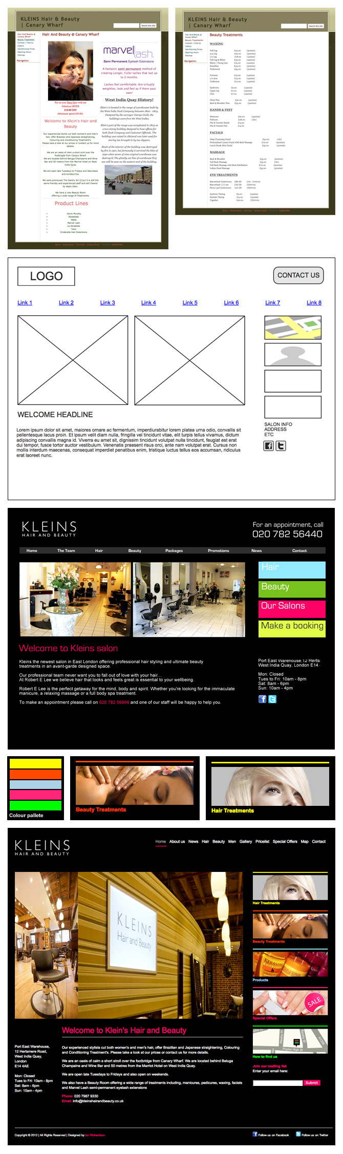
Wireframe for Kleins Hair and Beauty
- Original website
- Wireframe
- Initial Photoshop layout
- Colour palette
- Added detail
- Final layout
In the initial meeting with the clients, we discussed their brief which was a need for a redesign of the current Kleins Hair and beauty website. They felt it didn't project the company's image and was too confusing to look at. Their main objectives included a clear structured layout and some introduction of bright sharp colours on a black background with simple fonts, with a full width horizontal menu with links to several key pages highlighted on a sidebar. Also needed was a join mailing list option and some link to the Kleins salon Facebook and Twitter accounts.
Next, using the wireframe application Mockingbird, I laid out a wireframe, ran it past the clients then took the design to Photoshop to do the first initial layout.
The clients instantly felt that the structure was very much the what they wanted and that we were ready to add some more style and life to it.
Some of their comments included:
* The large contact details fought with the logo and the fact people were on their homepage already meant potential clients could find their phone number in the introduction text. I would have prefered to leave it big at the top for maximum exposure but understood they wanted their brand to stand out at the top of the website.
* The main navigation seemed too visual on the grey banner. I suggested to move the whole top navigation to the top right of the site so freeing up the main content and sidebar area. Any rollover effect would be a simple pink underline rule - the clients were happy to go with this.
* They loved the bright coloured sidebar links - the colour palette was just what they were after too - bright but not too in your face.
* I asked if they wanted images added to these links to give it a bit more personality which they said yes to. I also asked to use bigger images on a rotating carousel rather than the two requested static ones. This would offer some needed life to the layout.
I also tweaked a few other things that was brought up and sent the layout back for approval. The clients at Kleins were highly satisfied with the look and feel of their new homepage and from there I took design into the building stage.